
Poor web design isn't just an aesthetic problem; it can cost businesses up to 35% of revenue through lost conversions and frustrated users. Yet many startups and SMEs still treat their website as an afterthought rather than a growth engine. Modern web design combines responsive layouts, accessibility standards, and performance optimisation to transform your online presence into a powerful business asset. This guide reveals the core principles and practical strategies you need to build a website that attracts visitors, converts them into customers, and scales with your business.
Table of Contents
- Key takeaways
- The fundamentals of modern web design
- Balancing design aesthetics: minimalism vs brutalism
- Scalable architecture and future-proofing your website
- Measuring success and optimising for conversion
- Digital Sphere solutions for modern web design
- Frequently asked questions
Key Takeaways
| Point | Details |
|---|---|
| Responsive design foundations | Create responsive layouts using container queries, CSS clamp typography and flexible layouts with Flexbox and Grid to adapt content across devices. |
| Accessibility for all | Follow WCAG guidelines with colour contrast, keyboard navigation, screen reader support and semantic HTML to widen your potential customer base. |
| Performance optimisation | Optimise performance by improving Core Web Vitals, compressing images, using modern formats such as WebP, implementing lazy loading and minimising JavaScript execution. |
| Real device testing | Test your site on actual devices rather than relying solely on browser tools to reveal issues with touch targets, gesture controls and network variability. |
The fundamentals of modern web design
Responsive design forms the backbone of every successful business website. Your site must work flawlessly whether someone visits from a mobile phone during their commute, a tablet whilst relaxing at home, or a desktop computer in their office. Modern web design emphasises fluid layouts using container queries, clamp for typography, and intrinsic CSS techniques like Flexbox and Grid to ensure adaptability across devices without rigid breakpoints.
Fluid layouts represent a significant evolution from the fixed breakpoint approach of earlier responsive design. Instead of defining specific widths where your layout changes, container queries allow components to adapt based on their parent container's size. This creates truly modular designs where each element responds intelligently to its available space. Typography scales smoothly using CSS clamp(), which sets minimum, preferred, and maximum sizes that adjust proportionally to viewport dimensions. This ensures readability remains optimal whether users view your content on a 320px mobile screen or a 2560px desktop monitor.
Accessibility standards aren't just about compliance; they're about expanding your potential customer base. Following WCAG guidelines means people with visual, auditory, motor, or cognitive disabilities can use your site effectively. This includes proper colour contrast ratios, keyboard navigation support, screen reader compatibility, and clear content structure. When you prioritise accessibility, you're also improving the experience for everyone, including users on slow connections or older devices. The importance of online presence in 2025 extends to ensuring every potential customer can engage with your business.
Performance optimisation directly impacts your bottom line. Core Web Vitals, Google's user experience metrics, measure loading speed, interactivity, and visual stability. Sites that score well in these areas rank higher in search results and retain more visitors. Optimise images through compression and modern formats like WebP, implement lazy loading for below-the-fold content, and minimise JavaScript execution time. Every second of delay in page load time can reduce conversions by significant margins, making performance a critical business priority rather than a technical nicety.
Pro Tip: Test your website on actual devices rather than relying solely on browser developer tools. Real-world performance often differs from simulated environments, and physical testing reveals issues with touch targets, gesture controls, and network variability that desktop testing misses.
Key elements of modern web design include:
- Fluid typography that scales proportionally across viewport sizes using CSS clamp()
- Container queries that allow components to adapt based on available space rather than viewport width
- Semantic HTML5 elements that improve accessibility and search engine understanding
- Optimised asset delivery through CDNs, compression, and modern image formats
- Progressive enhancement that ensures core functionality works even when advanced features aren't supported
For a comprehensive understanding of responsive web design principles, explore implementation techniques that balance aesthetic appeal with technical performance.
Balancing design aesthetics: minimalism vs brutalism
Minimalism dominates modern web design with its clean interfaces, ample white space, and streamlined navigation. This approach prioritises speed and clarity, removing visual clutter that might distract from core conversion goals. Users can quickly find information and complete desired actions without cognitive overload. However, minimalism carries risks. When executed without strategic brand differentiation, sites can appear generic or indistinguishable from competitors. The proliferation of Stripe-inspired designs demonstrates how minimalism, whilst effective, can lead to visual homogeneity that fails to establish memorable brand identity.

Brutalism offers a stark contrast with its raw, unpolished aesthetic that deliberately breaks conventional design rules. Bold typography, unconventional layouts, and striking colour combinations create websites that demand attention and stick in memory. This approach works particularly well for creative agencies, fashion brands, and businesses targeting audiences who value authenticity and edge over polish. Minimalism offers speed and clarity whilst brutalism emphasises personality and differentiation; balancing brand point of view is key. Yet brutalism presents usability challenges when designers prioritise aesthetics over accessibility and intuitive navigation.
Effective design balances brand voice with usability standards. Your website should reflect your company's personality whilst ensuring visitors can accomplish their goals efficiently. This means incorporating distinctive brand elements, colour schemes, and typography that differentiate you from competitors without sacrificing clarity or accessibility. Create strategic tension through unexpected design choices that surprise users whilst maintaining familiar navigation patterns and interaction models. This approach makes your site memorable without frustrating users who expect certain conventions.
Startups benefit enormously from defining their unique brand viewpoint before making design decisions. What perspective does your company bring to your industry? What values drive your business approach? How do you want customers to feel when interacting with your brand? Answering these questions informs design choices that authentically represent your business rather than following trends that might not align with your identity. Digital Sphere helps businesses discover and express their brand voice through strategic design that balances distinctiveness with usability.
Strategies for balancing aesthetics and usability include:
- Layer brand elements strategically without overwhelming core content or calls to action
- Use white space purposefully to create visual hierarchy and guide user attention
- Implement distinctive typography that enhances readability whilst expressing brand personality
- Apply colour psychology to evoke desired emotional responses without compromising accessibility
- Test unconventional design choices with real users to ensure they enhance rather than hinder experience
Understanding that clean UI alone isn't a brand strategy helps you avoid the trap of prioritising visual minimalism over meaningful differentiation.
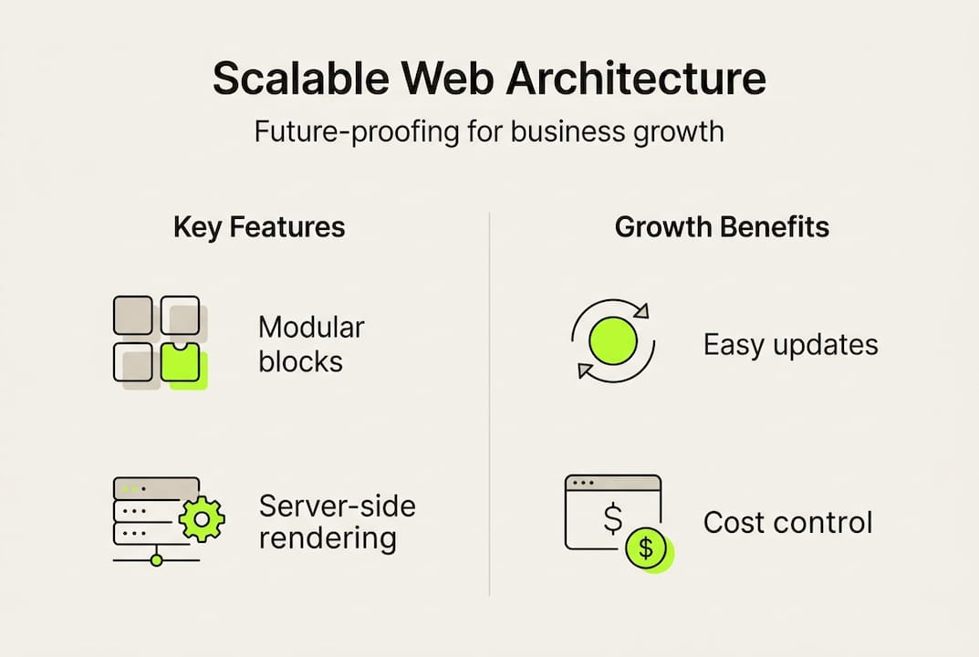
Scalable architecture and future-proofing your website
Scalable architecture determines whether your website supports business growth or becomes a bottleneck requiring expensive redesigns. Server-first rendering frameworks like Next.js improve performance by generating HTML on the server before sending it to browsers, reducing client-side processing and improving SEO through faster initial page loads. This approach also enables better caching strategies and reduces the JavaScript burden on user devices, particularly benefiting mobile users on slower connections or older hardware.
Modular design allows easy updates and feature additions as your business evolves. Rather than building monolithic pages where changing one element affects everything else, modular approaches create self-contained components that can be rearranged, updated, or replaced independently. This flexibility proves invaluable when launching new products, adjusting messaging based on market feedback, or scaling content production. Component libraries ensure consistency across your site whilst enabling rapid iteration without introducing visual or functional inconsistencies.
Design for future growth with scalable, modular architecture and server-first rendering to absorb business growth without major redesigns. Websites built without scalability in mind often require complete rebuilds within 18 to 24 months as traffic increases, content expands, or new features become necessary. These redesigns disrupt operations, consume resources, and risk losing SEO value accumulated over time. Investing in proper architecture upfront costs less than repeated rebuilds whilst maintaining business continuity.
Budget-friendly tools democratise access to professional web design for startups and SMEs. Platforms like Webflow provide visual development environments that generate clean, semantic code without requiring extensive programming knowledge. Wix offers templated solutions with responsive design built in, allowing businesses to establish online presence quickly and affordably. These tools have matured significantly, now supporting custom domains, e-commerce functionality, and integration with marketing automation platforms. For guidance on budget web design approaches for SMEs, explore options that balance cost with capability.
Regular testing and iterative improvements maintain optimisation as your content and traffic grow. Implement continuous monitoring for Core Web Vitals, conduct periodic accessibility audits, and gather user feedback through surveys and behaviour analytics. Small, frequent updates based on data prove more effective than sporadic major overhauls. This approach identifies problems early before they significantly impact conversions or user satisfaction.
Pro Tip: Establish a content governance system from the start that defines how new pages, images, and features get added to your site. Uncontrolled growth creates technical debt that degrades performance and complicates maintenance, ultimately necessitating the costly redesigns you're trying to avoid.
Steps for implementing scalable architecture:
- Choose frameworks and platforms that support server-side rendering and static site generation
- Establish a component library with reusable UI elements that maintain consistency
- Implement version control and staging environments for testing changes before deployment
- Document your design system including typography scales, colour palettes, and spacing conventions
- Plan for content growth by structuring databases and content management systems with scalability in mind
- Monitor performance metrics continuously and set alerts for degradation
| Approach | Best for | Scalability | Cost |
|---|---|---|---|
| Custom development | Unique requirements, complex functionality | Excellent with proper architecture | High initial, lower maintenance |
| Webflow | Design-focused teams, marketing sites | Good for moderate traffic | Medium, subscription-based |
| Wix | Quick launch, limited customisation | Adequate for small sites | Low, subscription-based |
| WordPress | Content-heavy sites, blogs | Good with proper hosting | Low to medium, varies by hosting |
Partnering with experienced developers or agencies like Digital Sphere ensures your technical foundation supports long-term business objectives rather than creating future obstacles.
Measuring success and optimising for conversion
Tracking key performance indicators reveals how effectively your website supports business goals. Service conversion rates typically range from 3% to 5% for well-optimised sites, meaning 3 to 5 visitors out of every 100 complete a desired action like requesting a quote, booking a consultation, or making a purchase. Bounce rates indicate the percentage of visitors who leave without interacting, with rates above 60% suggesting content misalignment or usability issues. Load times directly correlate with conversions, as each additional second of delay reduces conversion likelihood.
Effective calls to action guide visitors toward conversion without appearing pushy or manipulative. Position CTAs prominently above the fold and repeat them strategically throughout longer pages. Use action-oriented language that specifies the benefit users receive rather than generic phrases like "click here" or "learn more." Implement contrasting colours that draw attention without clashing with your overall design aesthetic. Trust signals including customer testimonials, security badges, and industry certifications reduce friction by addressing common objections before they arise.
Poor UX can cost up to 35% revenue, whilst redesign ROI can reach 485% in services; measuring conversions is essential. These statistics underscore why treating web design as a strategic investment rather than a cosmetic expense makes sound business sense. Calculate your customer lifetime value and compare it against the cost of acquiring customers through your website. This perspective helps justify design improvements that might seem expensive initially but generate substantial returns through increased conversion rates.
Analytics tools provide the data foundation for informed optimisation decisions. Google Analytics tracks visitor behaviour, traffic sources, and conversion paths. Heatmapping tools like Hotjar reveal where users click, how far they scroll, and where they abandon forms. Session recording shows actual user interactions, highlighting confusion points that quantitative data might miss. Combine these insights to identify friction points systematically rather than relying on assumptions about what users want or need.
Iterate marketing messaging and design elements based on data-driven insights for continual improvement. A/B testing compares different versions of pages or elements to determine which performs better. Test one variable at a time to isolate what drives improvement. Common elements worth testing include headline copy, CTA button text and placement, form length, image choices, and page layouts. Even small improvements compound over time, with incremental gains accumulating into substantial conversion increases. Understanding how to maximise online presence includes ongoing optimisation rather than one-time implementation.
Key metrics to monitor include:
- Conversion rate by traffic source to identify which channels deliver qualified visitors
- Average session duration indicating content engagement and relevance
- Pages per session showing how effectively your site encourages exploration
- Exit pages revealing where users lose interest or encounter problems
- Form abandonment rates highlighting friction in conversion processes
| Metric | Good benchmark | Action if below |
|---|---|---|
| Service conversion rate | 3-5% | Review CTAs, simplify forms, add trust signals |
| Bounce rate | Below 60% | Improve headline/content alignment, enhance page speed |
| Average session duration | 2+ minutes | Create more engaging content, improve internal linking |
| Pages per session | 2+ pages | Strengthen calls to action, improve navigation clarity |
Digital Sphere solutions for modern web design
Implementing modern web design principles requires expertise spanning responsive development, accessibility standards, performance optimisation, and conversion strategy. Digital Sphere specialises in creating websites that combine these elements into cohesive solutions tailored to startup and SME needs. Our team builds responsive, scalable sites using server-first rendering frameworks and modular architectures that grow with your business. We focus on delivering measurable results through designs that convert visitors into customers whilst establishing strong brand identity.
Our customer dashboard provides transparent insights into your site's performance, tracking key metrics and highlighting optimisation opportunities. You'll see exactly how your website contributes to business growth through clear reporting on traffic, conversions, and user behaviour. We also offer downloadable resources including our comprehensive web design ebook that guides you through maintaining and improving your online presence. Partner with Digital Sphere to ensure your business website delivers strong ROI through modern design techniques that prioritise both aesthetics and performance.
Frequently asked questions
What is the role of typography in modern web design?
Typography enhances readability and adapts fluidly across devices using CSS clamp and variable fonts that scale proportionally to viewport dimensions. It also reflects brand personality through font choices, weights, and spacing that convey professionalism, creativity, or approachability. Well-executed typography improves user engagement by making content easier to scan and digest, directly supporting conversion goals.
Why is mobile-first design critical for startups?
Mobile-first design addresses the reality that over 60% of web traffic comes from mobile devices, ensuring accessibility and performance where most users actually engage with your site. It improves search engine rankings since Google prioritises mobile-optimised sites in results. Starting with mobile constraints forces focus on essential content and functionality, creating cleaner experiences across all devices.
How can startups balance creativity and usability in web design?
Combining elements of minimalism and brutalism strategically preserves brand identity without compromising user experience by applying distinctive design choices to non-critical elements whilst maintaining conventional patterns for navigation and conversion paths. Testing design decisions with real users through A/B tests and usability studies reveals whether creative choices enhance or hinder effectiveness. Feedback loops help find the right balance between memorability and functionality.
What tools are best for budget-conscious startups building responsive sites?
Platforms like Webflow and Wix provide cost-effective, easy-to-manage responsive website solutions with visual development environments that don't require extensive coding knowledge. They support growth through scalable hosting, e-commerce capabilities, and integration with marketing tools. These platforms offer subscription-based pricing that spreads costs over time rather than requiring large upfront development investments, making professional web presence accessible to startups with limited budgets.